Take Me Away

Anyone remember the “Take Me Away” Calgon commercial from the ’80s? I remember using this phrase frequently during my previous life in day job world. It would always make me smile even when flames were coming out of whatever problem was going on. Before I continue, I will welcome new readers to this post and blog. Welcome! And, share the purpose, focus and nature of these colorful, weekly posts.
Small Spaces Special Places
Each year, I select a theme for my weekly paintings. This year’s is “Small Spaces Special Places.” One of the reason for this theme is I have been surprised, even delighted, with the small spaces in our house that have captured my eye.
Then, there are the special places I see on my daily dog walks here in Raleigh. You would be amazed at the glimpses of beautiful moments I see. Each morning, rain or shine, I love getting outdoors and looking for special places to paint.
Most weeks, I also share an exercise and/or a painter who inspires my work. If you know someone who you think might enjoy a weekly dose of color, with a dash of art history, please encourage them to sign up here for this weekly blog.
Inspiration
This week’s inspiration is from a woman landscape painter who hails from my home state of Massachusetts. Woot! And, what a mighty landscape painter she was. Especially when I realize that she painted at a time when women were not allowed to walk outdoors alone, let alone paint outdoors (aka en plein air).
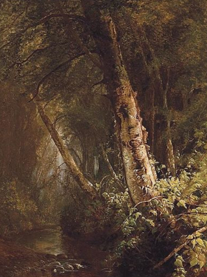
Her name is Julie Hart Beers. Her paintings are incredible! Check out this wonderful painting entitled “Old Birch.”

What’s fantastic about this painting is the gorgeous light on the birch tree in the foreground. And, the misty, blue light in the background off to the left. This painting feels as if we should all grab our canoes or kayaks or galoshes and wander. Where? I would continue on along the creek to see what lies in the woods. If I could wander in this painting, I would wonder what lies ahead. Who knows, maybe there is fantastic vista, a view of mountains or acres of fields. What do you think?
I love seeking and finding artists in history who inform the paintings I create. And, frankly, I am cultivating painting references to help me see what my ideal painting is and to forge a way forward.
I definitely studied the composition of this painting. How? I did timed color sketches. These are exercises that I have done in the past. They are helping my pace of painting quite a bit. I shared more about this practice in last week’s post.
This week’s painting
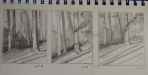
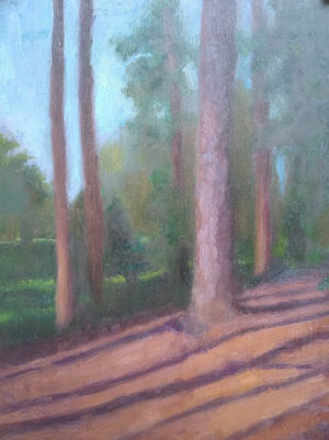
I decided to seek out a wooded setting this week. And, I definitely thought about the light in Beers’ painting. Luckily, we have a park across the street from our house in downtown Raleigh. The morning light on a big pine tree caught my eye right away. I decided to sketch out some options before committing to the painting. Here are the drawings I did.

Ultimately, I chose the composition on the left. Why? By the time I completed that (the 3rd) sketch, I knew I wanted to simplify and leave out some of the objects that were in the park. There’s a magnolia that had several branches that stretched over the big pine tree. That seemed distracting so I left it out.
Why Take Me Away
As I worked on this painting I was so grateful for the sun. Especially when I look back on the past month when we had weeks of cold rain. I felt so grateful for the soft leaves and pine needles under my feet. And, I wanted to infuse the painting with a feeling of warmth, gratitude and comfort.
I smiled as I thought of that crazy commercial entitled “Take Me Away” and knew that had to be the name of this week’s painting too.

This painting is for sale for $180 plus shipping. Please contact me if you think this painting will be happy in your home.
What Takes You Away
How about you gentle reader? What helps you have a “Take Me Away” moment? Please do tell and share in the comments below.

3 Comments
Beth Dyer Clary
March 11, 2021If I had to choose which painting to be taken away in, I would definitely choose yours, Julie. There is something a bit eerie and spooky about Beers’ painting. Don’t get me wrong – it’s gorgeous with those layers of light and texture. I can smell that dampness in her painting, if that makes sense.
Still, I love the light and colors in yours. Of course I’m finding I like the openness of prairies and marshes more than the”walls” that mountains provide and the shelter of the woods.
Fun to think about that funny commercial from yesteryear – makes me want to step away into a bubble bath right now. Ever thought of painting bubbles or a bathroom?
Beth
Julie Holmes
March 12, 2021That’s interesting that you see Beers’ painting as more eerie, Beth! I don’t have that same sense.
Thank you for enjoying the light in this week’s painting. I was smitten with the light and shadows from all the trees in that section of the park.
That Calgon ad cracks me up, too. But it doesn’t motivate me to paint bubbles.
HA!
I did paint my bathroom earlier this year. In fact, I think it’s the first painting I posted in 2021; our sweet, small hall bath.
Thanks so much for reading and commenting here tooooooooo!
Julie Dyer Holmes, Fine Artist Take Me Away Reloaded - Julie Dyer Holmes, Fine Artist
January 19, 2022[…] tools reminds me that I used this expression, take me away, in a previous post. Here’s that post, of the same name, from March of last year. Ha! It makes me realize that the state of our current […]